Hosting
A Basic Chart
See below the added chart found in the repository.
A Chart from the Web
Another portfolio task is to add a chart from the web. Here is a chart that is not stored locally. This chart displays gun deaths and income. Using various US states, it shows median income on the x-axis and firearm deaths per 100,000 on the y-axis.
Building
Adding in a Personal Chart
Portfolio Task 2 is to add our own charts. The following chart shows public sector employment in the UK.
Adding in Another Personal Chart
The second chart shows internal displacement in Bangladesh.
Debate
Use Visualisation in Policy Commentary
Visualising the "aggregation problem" in global policy data
Should global progress on SDG 6 be judged by overall averages, or by improvements amongst the most disadvantaged groups?
The first chart shows that global access to safely managed drinking water has improved only marginally, suggesting progress towards SDG 6.1 may be minimal:
Disaggregated Analysis
Yet the second chart reveals faster improvement in rural areas, illustrating how disaggregated data exposes hidden progress and the need for targeted policy investment.
Replication
Re-creating and Improving Someone Else's Chart
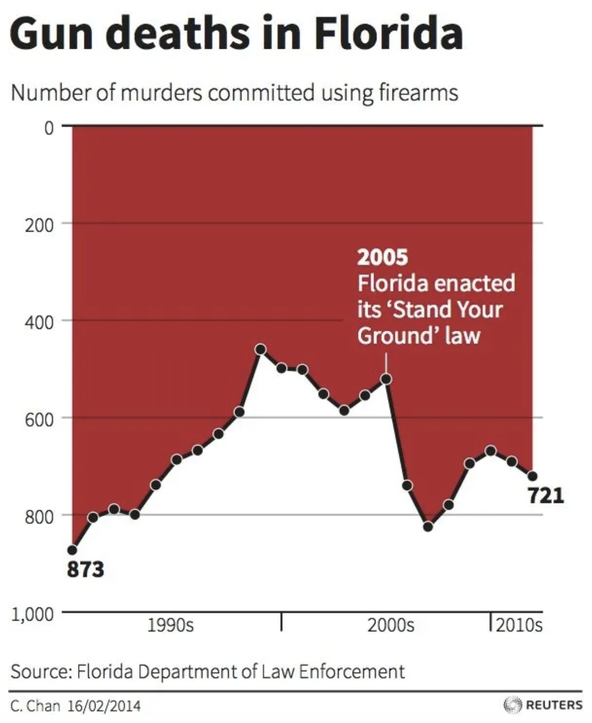
The following shows the Reuters "Gun deaths in Florida" chart. A reversed y-axis made it seem gun deaths declined after Florida's "Stand Your Ground" law in 2005, prompting backlash over how visual design can distort reality.
My Replication
Below is my replication of the above chart.
Improved Version
And finally, here is an improved version of the chart. The revised graph corrects the inverted y-axis to ensure accurate interpretation and incorporates interactive tooltips to improve data transparency and user comprehension.
Accessing Data
API Task
The following shows data on crime in London, accessed via an API.
API Functional Description
Base URL: https://data.police.uk/api/
Endpoint: crimes-street/all-crime
Parameters:
lat- Latitude coordinate (e.g., 51.5074 for central London)lng- Longitude coordinate (e.g., -0.1278 for central London)
Full URL used: https://data.police.uk/api/crimes-street/all-crime?lat=51.5074&lng=-0.1278
Scraper Task
Data collection and analysis using web scraping techniques. The chart below visualises data extracted through web scraping and processed in Python.
I explored the frequency of certain words used on news websites when reporting crime in their headlines. I compared BBC News, The Guardian, Sky News and GB News.
View the full analysis:
Loops
Building a Dashboard
The following shows a dashboard built using JavaScript loops and multiple food Producer Price Index datasets, demonstrating programmatic chart generation.
View the Python notebook showing the data download process using loops:
Maps
Choropleth Map (Scotland)
The following shows a choropleth map of happiness scores in Scotland by Local Authority Districts, demonstrating geographic data visualisation.
Coordinates Map (Wales)
Here is a coordinates map of main GP Sites in Wales, plotting point data on a geographic canvas.
Big Data
Data Processing Methodology
Both charts use the Long Run Prices Database (LRPD), containing millions of price observations from 1988 onwards. To extract meaningful insights, I grouped data by product category and time period, calculating average prices to reduce dimensionality. The cake analysis aggregates prices monthly to show inflation trends, whilst the tampon analysis groups by region to reveal geographic pricing disparities across the UK.
Making a Cake Over The Years
Analysis of cake pricing trends over time using large-scale retail pricing data.
View the process:
Average Tampon Prices by Regions
Regional price analysis for feminine hygiene products, exploring geographic pricing patterns.
View the process:
Interactive Charts
Paracetamol Prices Over The Years
Interactive analysis of painkiller pricing trends with dynamic filtering and tooltips.
Suicide Rates by Social Group in England
Analysis of mental health outcomes across different social demographics, with interactive exploration.
Advanced Analysis and Machine Learning
Part 1: Comparing Weight Issues in England
Statistical analysis of health data across English regions using advanced analytical techniques.
Part 2: Life Expectancy Regression Analysis
Hypothesis
Higher income deprivation scores are associated with lower life expectancy, with this relationship being stronger for males than females across English local authorities.
Machine learning regression model predicting life expectancy based on socioeconomic and health indicators. This analysis explores the relationships between various factors and population health outcomes.
The interactive visualisation below shows the regression results with confidence intervals:
Regression Results
Male Model:
R² Score: 0.7188
RMSE: 0.6927 years
Coefficient: -1.1075
Intercept: 79.7256
Female Model:
R² Score: 0.4553
RMSE: 0.9238 years
Coefficient: -0.8446
Intercept: 84.0609
Key Findings
The hypothesis is confirmed: income deprivation significantly predicts life expectancy. The male model shows substantially stronger predictive power, suggesting socioeconomic factors affect male mortality more acutely than female.
For detailed methodology, model training, and statistical analysis, view the complete Python notebook: